

UX / RESEARCH / APP DESIGN
Duration
Role
Tools
Design Challenge
Background
Design Objectives
Design a digital solution to support and improve the holistic experience of office workers in Sydney with a fixed schedule of at least 30 minutes of bus commuting time.
Challenges
Time limit - We only had 12 weeks to create a solution from ideation to final prototyping.
Task allocation - I am the only UI Designer for our team for making the wireframe and prototype iterations.
Insufficient research data - Within a limited time, our team only conducted 15 exploratory interviews to center on the problems.
Process
We started the process by following the UX design process, from conducting qualitative user research to identify main demographic and their pain points to making iterated prototypes from low to mid to high-fidelity.
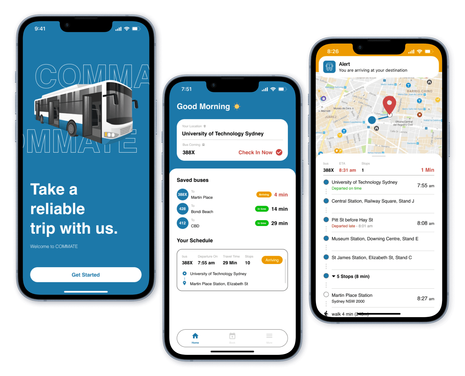
COMMATE App - Prototype Mockups
Research
Finding out what commuters really need
Understanding the people
Each team member conducted 3 semi-structured interviews, which has 23 open-ended questions, categorized into 6 different areas. Below are listed my interviewee’s quotes:
Participant 1
51yr English Teacher

“sometimes, I only have one bus available. Sometimes the timetable of the bus changes without me knowing. I have to take Uber home. Yeah, I'm very restricted to the to the bus”
“it's not so much the commute that bothers me. It's the fact that I have to wait for the one bus. sometimes I get to the bus stop and the bus has just passed, so then I have to wait 30 to 40, minutes for the next bus.”

Participant 2
30yr Front-end developer
“it's too easy to skip or pass the bus stop. You will get too relaxed or too focused on something. So you miss it.”
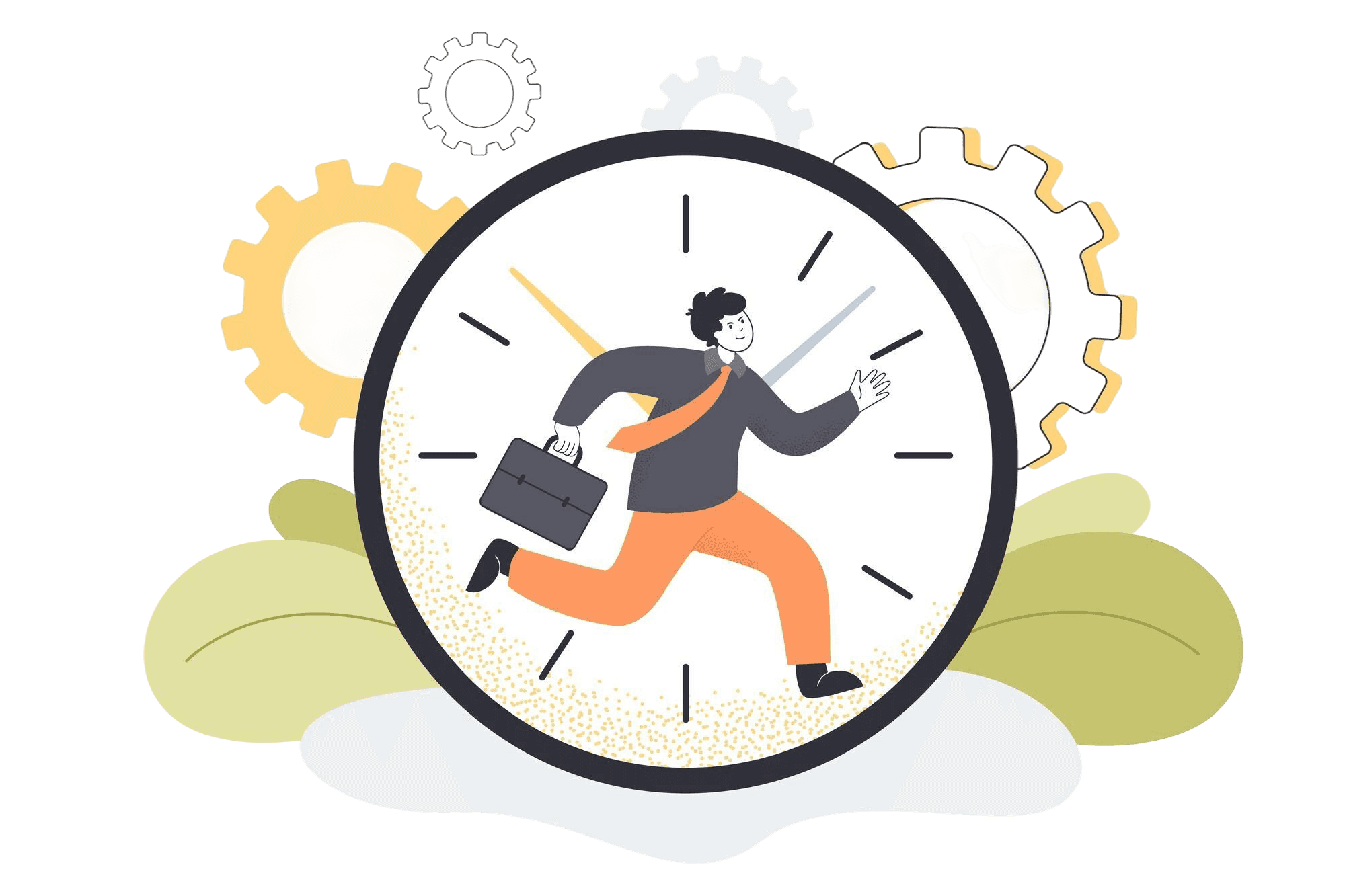
“it still take too long to arrive my office. It takes like 50 minutes. I think it's too long. It's way too long, especially in the morning. Like, I just want to sleep because of this. I need to wake up at like 7am yeah? I just want to sleep for a bit long.”
Research Insights
People who live in the suburbs, with few bus schedules, and people who have long-distance commutes, with 45 minutes to one hour commuting time, may have experienced bad scenarios in their everyday lives when they commute on the bus.
We found that getting on and off the bus smoothly on time is our main design focus that affects commuters’ overall experience.
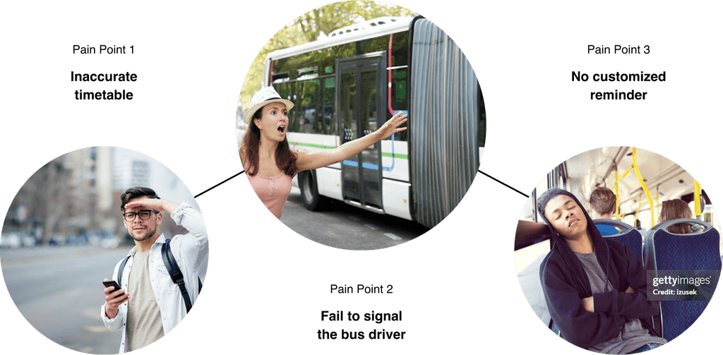
The inaccurate timetable on the App sometimes misleads them to miss the bus. They become nervous before they arrive at their destination because it’s easy to miss the bus stop if they are not paying attention to it.
People think arriving at their destination on time is the the first priority
Inaccurate timetable makes peoples, with few bus schedule in where they live, feel inconvenient.
People often feel stressed when they are about to getting on and off the bus
Three main insights
Define User Pain Points
When waiting on the bus, they can’t control their time properly due to an inaccurate timetable. When a bus is approaching, they may miss the bus because they can’t signal the bus driver effectively. When approaching the destination, there is no customized reminder for them to get off the bus.
Ideation
Purpose solutions for the commuters
Scoping out the MVP Features
The proposed solutions for the user's pain points are:
Time Management - Booking feature with commuting suggestions and rescheduling option
Diver Interaction - “Wave hand” feature to and “Stop” feature to inform and signal the bus driver
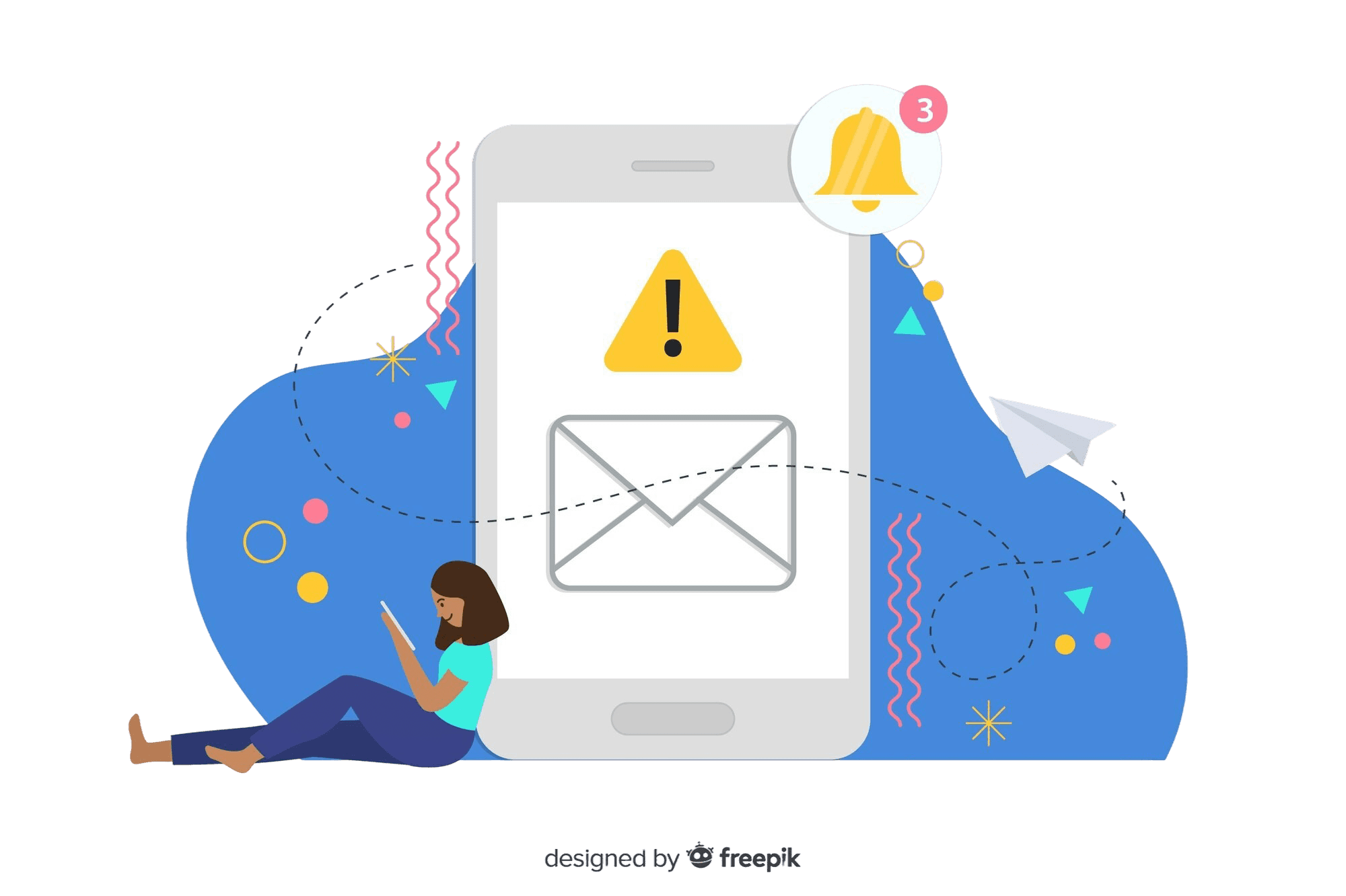
Notification & Alert - Delay, approaching, and arrival notification during the commuting process
I identified the MVP key features and set up the priorities by using the Must/Should/Nice Framework:
M
Must Have: Booking/Rescheduling, Notification/Alert feature
N
Nice to Have: Wave hand & Stop bus feature
The Must Have features are the booking and rescheduling feature and Notification & Alert feature. As the core features of the app, it helps users manage and get control of their time before they commute on bus. Also, the notifications help users get prepared for the actions during the commuting process.
The Nice to Have feature are diver interaction features such as wave hand to the driver or press the stop button. It could help users signal the bus driver more effectively but the priority is the last for product development process.
Evaluation
Improving and verifying useable ideas
User Testing
We design three scenarios for testing the usability of the App features. The feedback is collected for the improvement of the prototype.
SCENARIO 1
Trip Booking
and Management
Assess the effectiveness of the app's notification system in alerting a drowsy user and the functionality of the virtual stop button for early stopping.
The user wants to book a 30-minute bus trip from Blacktown to Parramatta for the next day at 9:30 am, with a recurring schedule on weekdays for two weeks. Then, the user wants to adjust the saved recurring trip
SCENARIO 2
Using the Virtual Stop Button after Alert
Test the comprehensive process of booking a bus trip, managing the commute schedule, and making adjustments.
A user has a saved trip from Central Station to Bondi Beach. On the day of the trip, they received a delay notification due to a traffic accident.
SCENARIO 3
Delay Notifications and Trip Adjustments
Evaluate the user's response to delay notifications and the process of modifying a saved trip for a single instance.
The user sleeps on the bus, traveling from Chatswood to North Sydney. They receive a notification that their destination is approaching, but they decide to stop at an earlier stop.
Visual Design
Visual consistency makes it professional
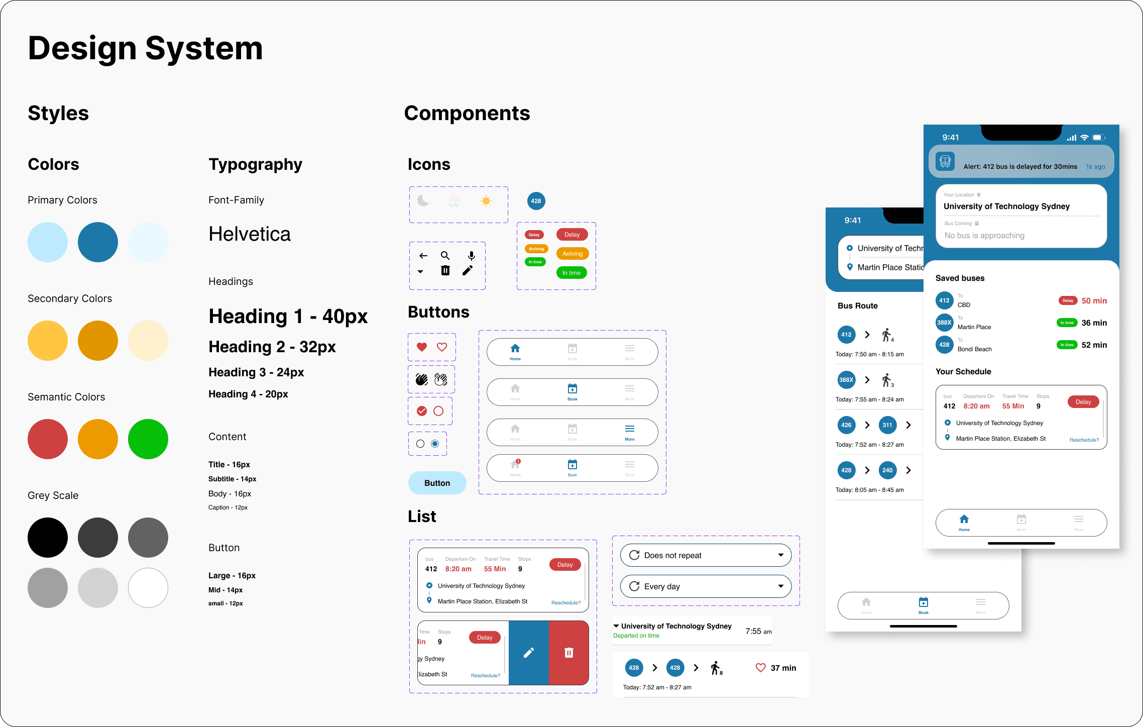
Design System
I created a design system for the high-fi prototype, including colors, typography, and components(icons, buttons, lists, cards) for organizing the whole project. It makes sure the visual design is consistent and the UI is adjustable.
Prototype
Balancing the usability and visual experience
High-Fi Prototype
The final high-fi prototype is redesigned by me after we finish the prototype-in-action video. I changed the brand color and many details after reviewing the whole evaluation process.
Final Outcome
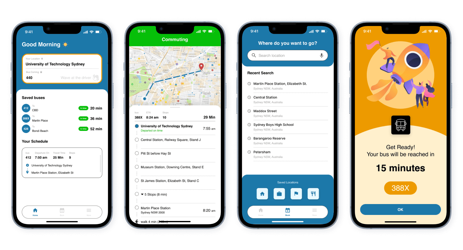
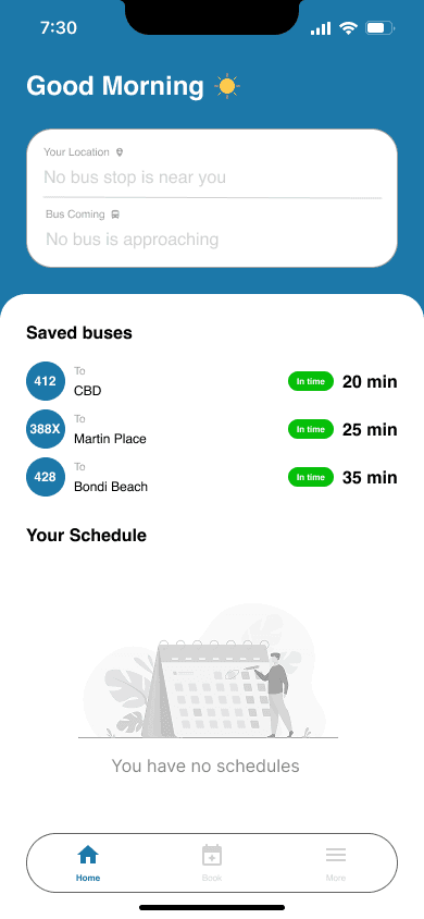
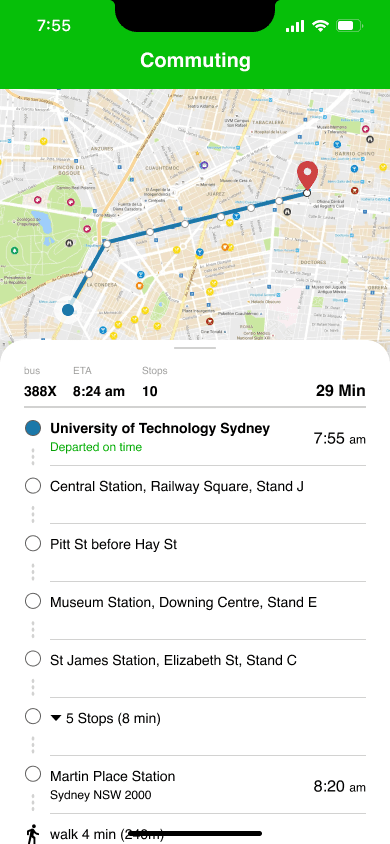
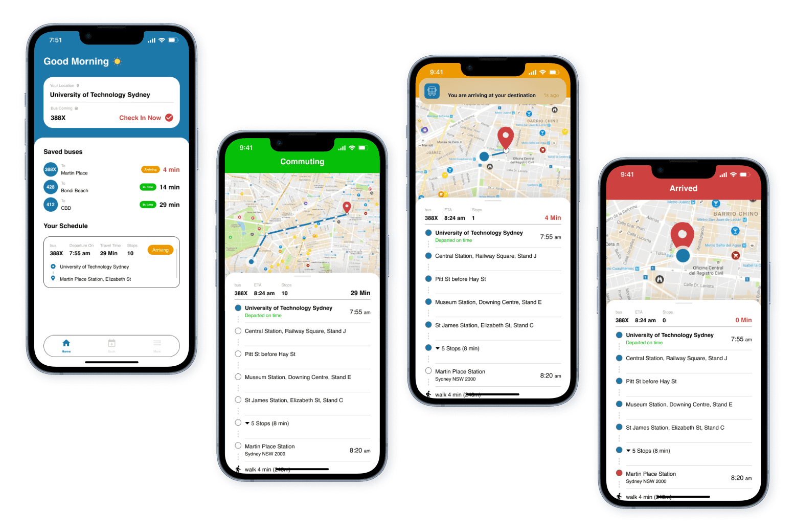
Home
Use as the main status board. The page can track buses' arrival and manage schedule bookings, providing alternatives when the booked bus has a serious delay. It has “Wave(Check-in)” and “Stop(Check-out)” features for signaling the driver. When users are commuting, the UI switches to commuting mode and shows each bus stop instantly.
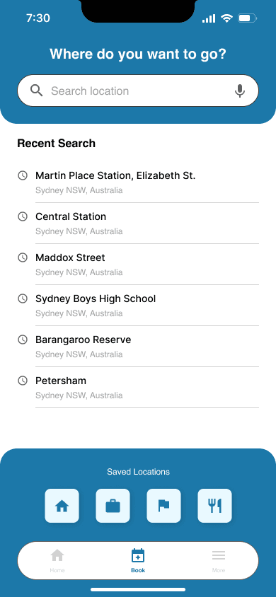
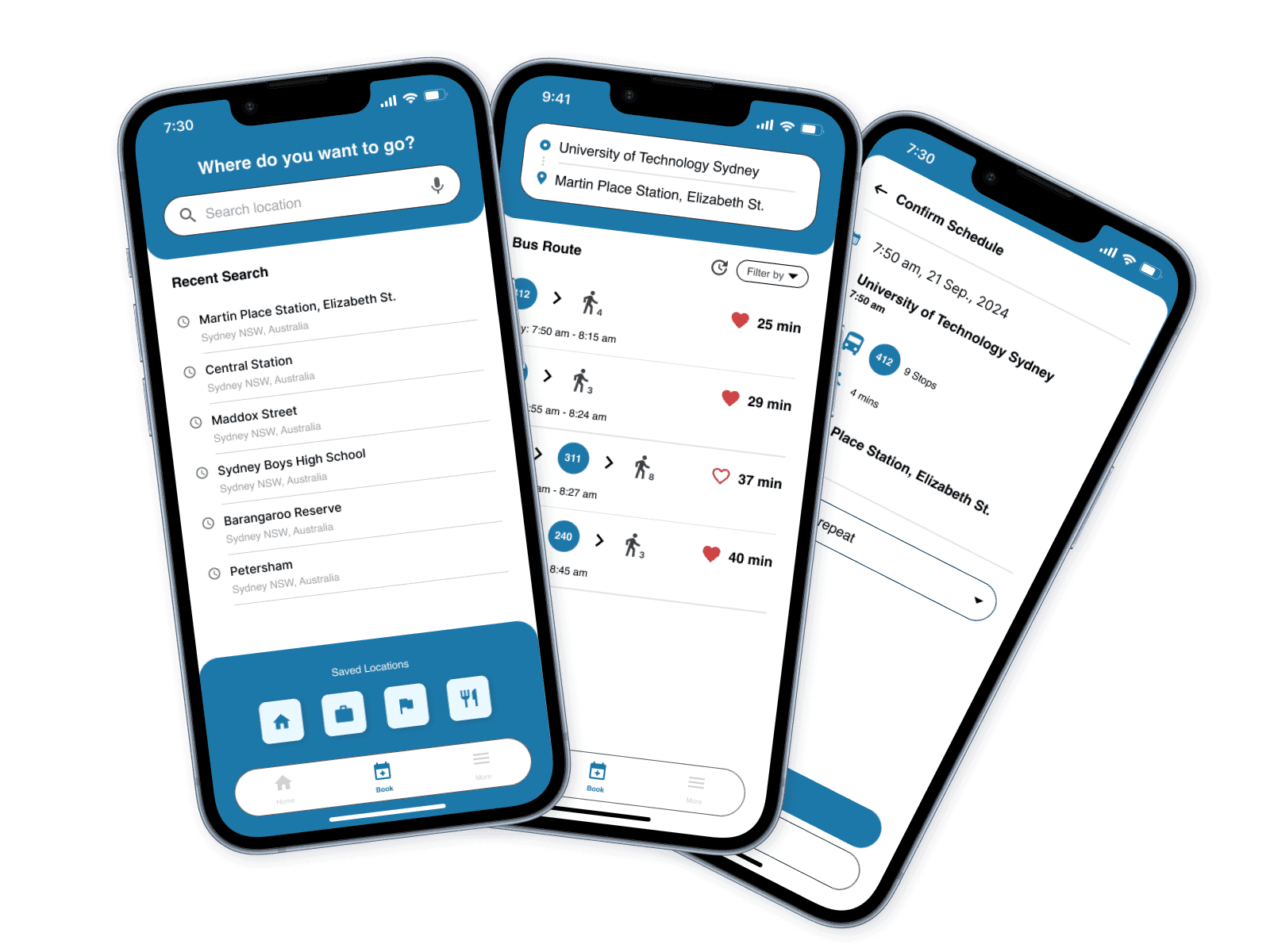
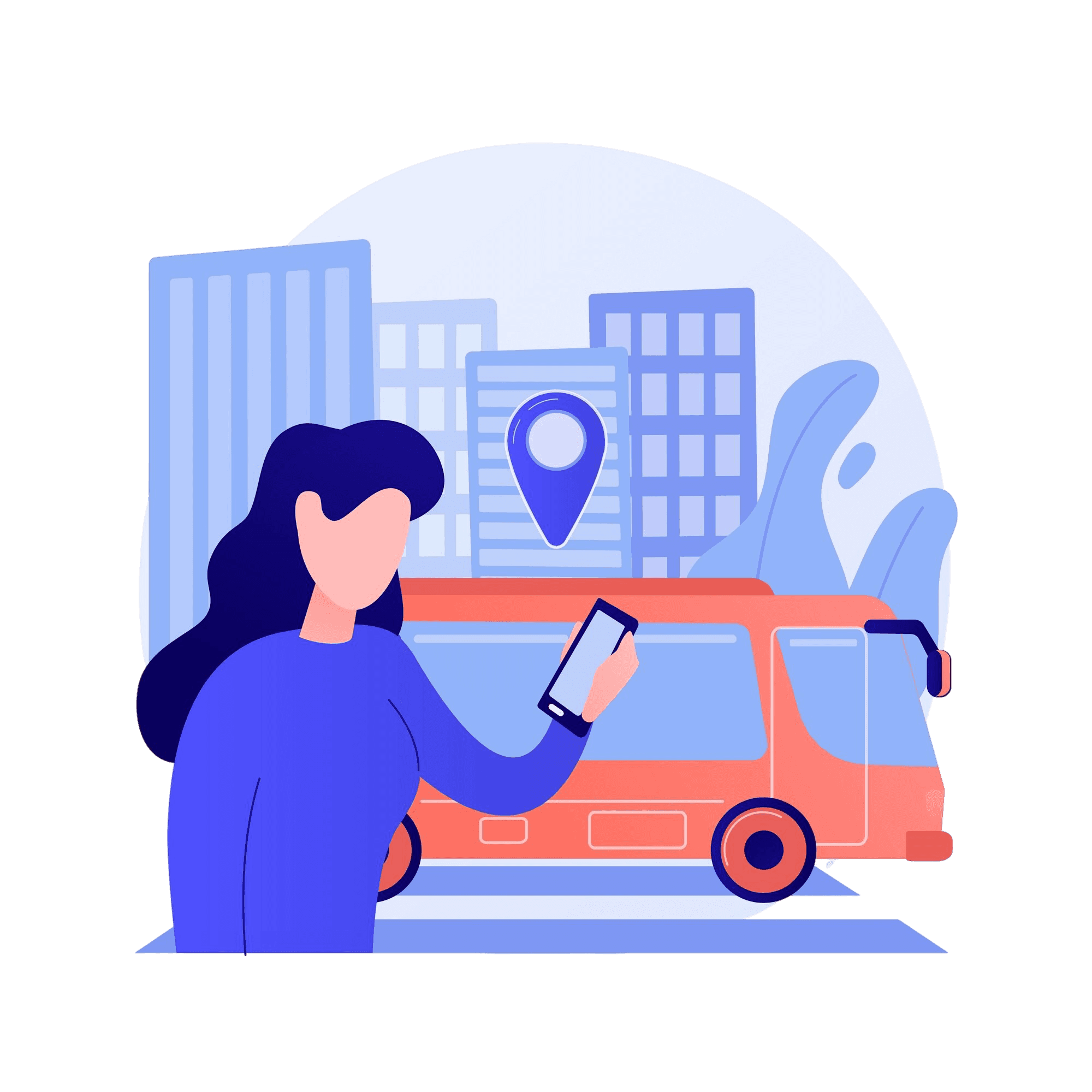
Book
Use for scheduling personal bookings for a bus. The feature automatically provides route and bus options to the destination. It also implements “saved” and “recent search” features to give users a better experience.
Announcement
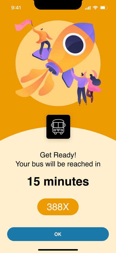
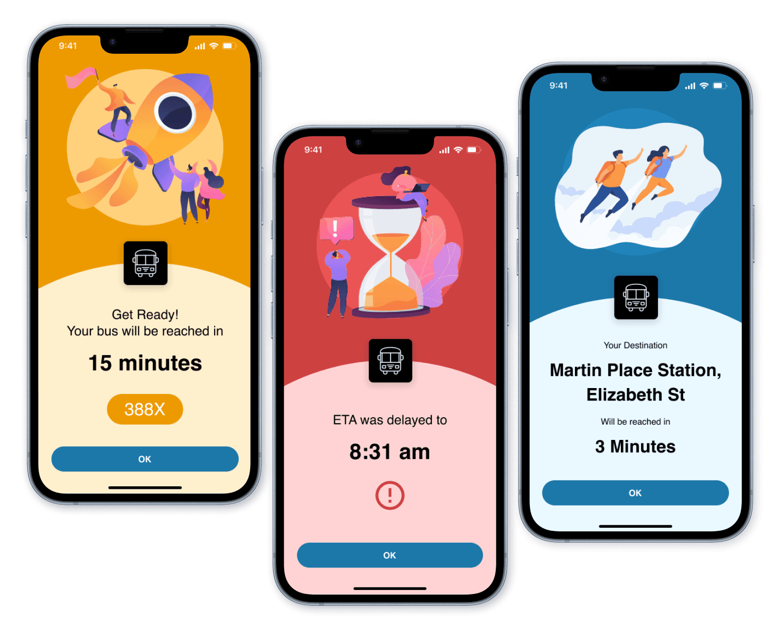
When users book a schedule and get on the bus, the announcements will show. They will interrupt the phone activities and display full screen to inform of important messages. A delayed announcement will be triggered when there is a serious delay for the bus. Arrival announcement will be triggered when the bus is about to arrive at the booked destination.
📖 Learnings and Takeaways
This project provided me with an opportunity to participate and make decisions in the whole UI/UX design process from start to end, including user research, ideation, prototyping, and evaluation. My supportive teammates have also given me many valuable feedback and suggestions for my UI design, which helps me improve to become a better UI/UX designer.
Having completed the Commate project, I had three takeaways:
Narrow down the scope first
Looking back, the reason for lacking enough research data is that we didn’t identify the commuting way of our target demographic first. We wasted days interviewing people who commute by car, metro. and train, but not the bus. Although we got many inspirations from all of them, there is too little data from our true demographic in the end. Making a solid design brief in the first place really matters.
Journey Map is a great tool
In this project, we implemented the journey map in the UX process, and it played an important role. It helped us not only visualize the emotions of our user but also identify their pain points. When using it with personas, we can see what the problems and needs from our personas. The result is amazing, and I believe I will keep using it for future UX projects.
User experience is part of the user testing
I used to treat the mid-fi prototype as a “color version” of the low-fi prototype, and we only need to consider the user experience on the high-fi prototype. However, it’s not the case at all. The purpose of the mid-fi prototype is to conduct user testing, but the users care about the user experience, and they will compare the prototype with the products they use every day. Designers must keep in mind that a high-quality mid-fi prototype is needed before the user testing.
We only have a limited time (12 weeks) to complete the prototype from scratch. If we have more time, the next step of Commate App project will be adding two parts. The first part is to keep improving the App UI to achieve a product-level MVP for both better usability and better user experience, tailored to Sydney bus commuters. The second part is designing the UI for the bus driver to receive the signal from passengers. The current prototype is imagined by us to it could work. We didn’t think of the difficulty of implementing the features on a real bus.
Overall, this project is a wonderful experience for me to learn and grow. I want to thank my teammates, participants, my tutor, and the lecturer at UTS in the end.
Prototype-in-action video
Role: Motion Graphic Design & Prototype UI design
Give it a try!
